


(Note: due to some publishing errors, this post is technically 6 minutes late and should’ve been posted yesterday (I’m writing this sentence at 12:07).)
My visit to the Cincinnati Art Museum was nothing short of amazing.
Their wildly expansive catalogue of paintings across so many different eras is immense in size and I managed to take over 200 photos of them.
Today, I’m sharing about forty of the best of those paintings and I’ve organized them from most realistic and life-like to most abstract and obscured in figure.
Visiting the museum, it really was extremely interesting to see that evolution of art towards such a point of intelligibility in subject; so, I hope you find it as curious as I did! (Although, of course, nothing beats the real thing: seeing physical paintings with physical, visible brushstrokes.)
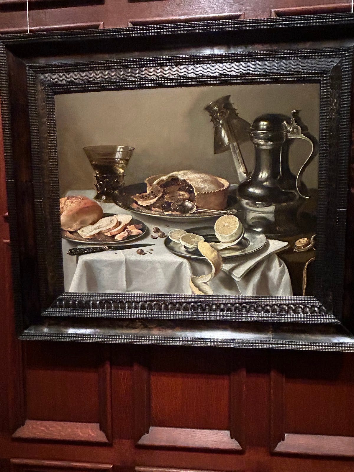
The skill in painting such a believable space, as Claesz displays in this piece, is quite impressive and the mood he creates with it is additionally impressive.
The lone lemon, which is the centerpiece of the picture, sits: balanced, yet slightly uneven creating a sort-of fog of uneasiness that coats the painting.
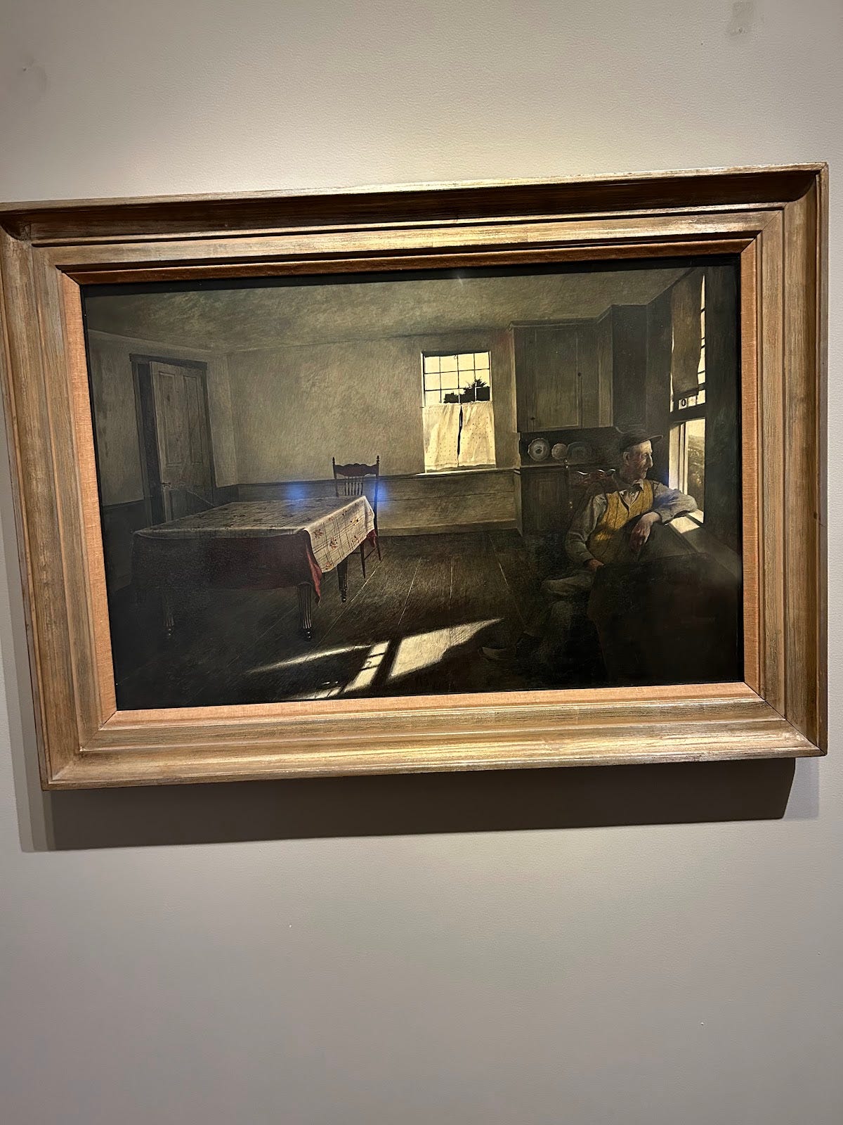
Teel’s piece here resembles the work of Hopper but with much less subtlety: (though, this isn’t necessarily a critique) the emotions of the subject and broader picture really hit the viewer in the face with a cement block of despair, anguish and loneliness.
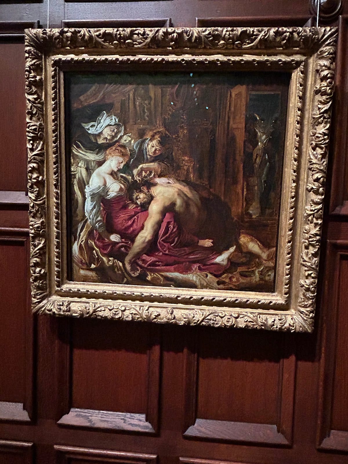
Unlike much of the very drab and neutral paintings of the 1600s, Rubens captures a distinct mood with his intense and dramatic portrayal of his subjects.
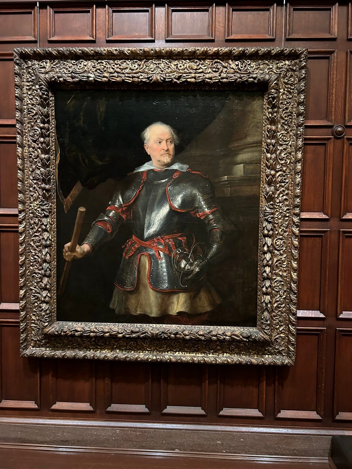
The feeling of superiority from the character in the middle is only heightened with van Dyck’s genius placement of a pillar in the background: which symbolizes, just as I’ve mentioned: feelings of superiority and judgement.
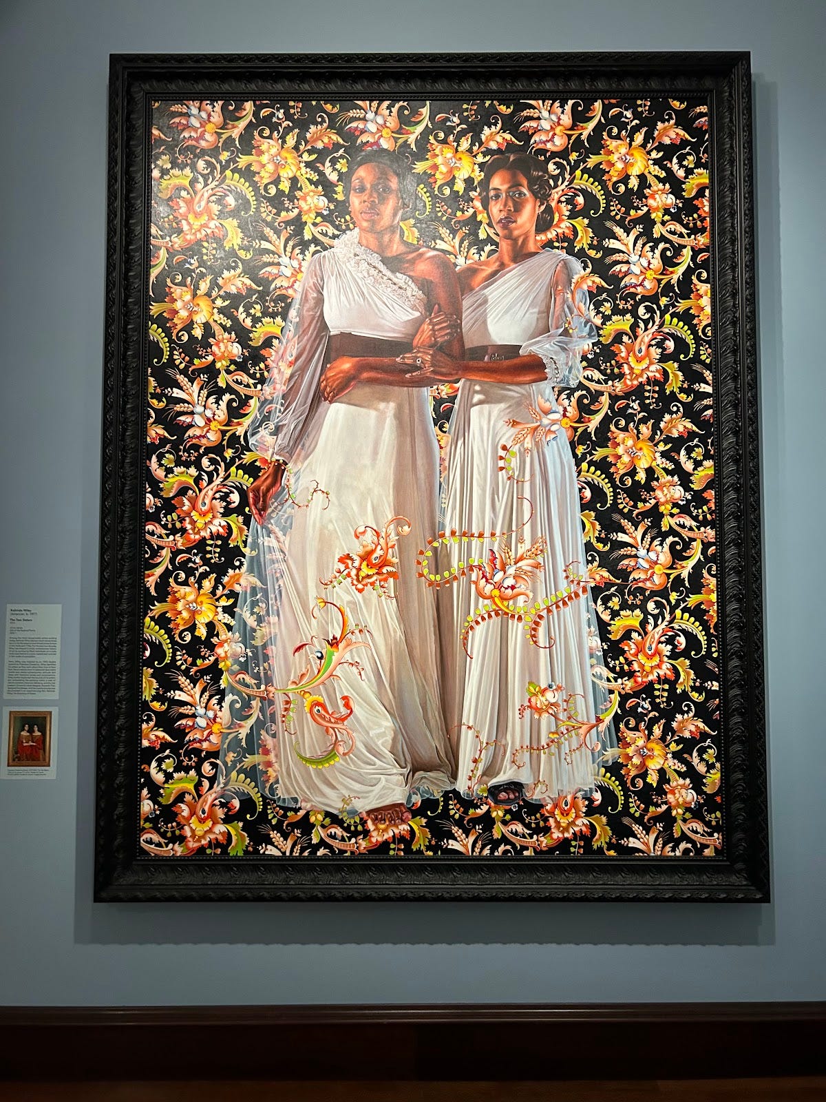
Somewhat like the previous entry, Wiley encapsulates feelings of righteousness and superiority with not only her very skill-full and accurate picture of her subjects but with the absolutely grand and immense size of the painting which directly matches the equally as grand facial expressions of the characters.
Pieces like this are perfect for stark comparisons of how much art has changed over the last few centuries: going from layers and layers of paint to capture a skin tone and methodically searching for flaw as to have to clearest picture of reality to, today’s art which often features faces and people as only a few blob and dots.
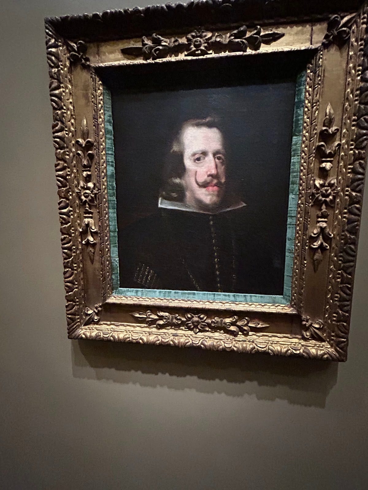
Shakespeare said that “brevity is the very soul of wit,” and if so modern art must be very witty and Velazquez’s painting: very dull.
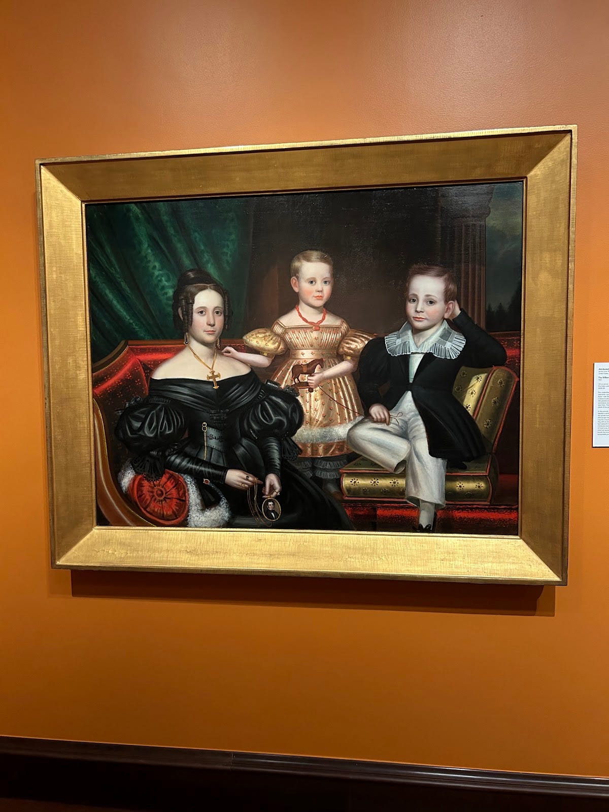
Though it wasn’t the artist’s intention, this painting comes off as a subtle mockery of itself when taken out of context: the smug expression on the child’s face and ridiculously over-the-top furniture and clothing (Although it is timely, to an untrained viewer the furniture and clothing still come across this way.) the subjects are wearing all culminates in the likely reasons that this painting was placed in a specific section of the museum of art containing political statements against capitalism, monopoly and so on.
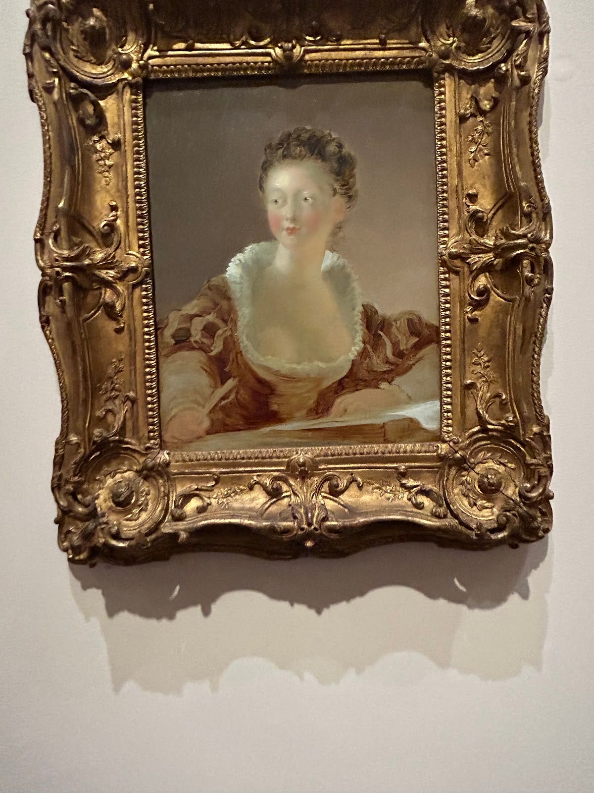
Providing a slightly 2D view of what is likely royalty, with very soft shadows, Fragonard pictures his subject’s gentleness yet potential vulnerability with these key motifs.
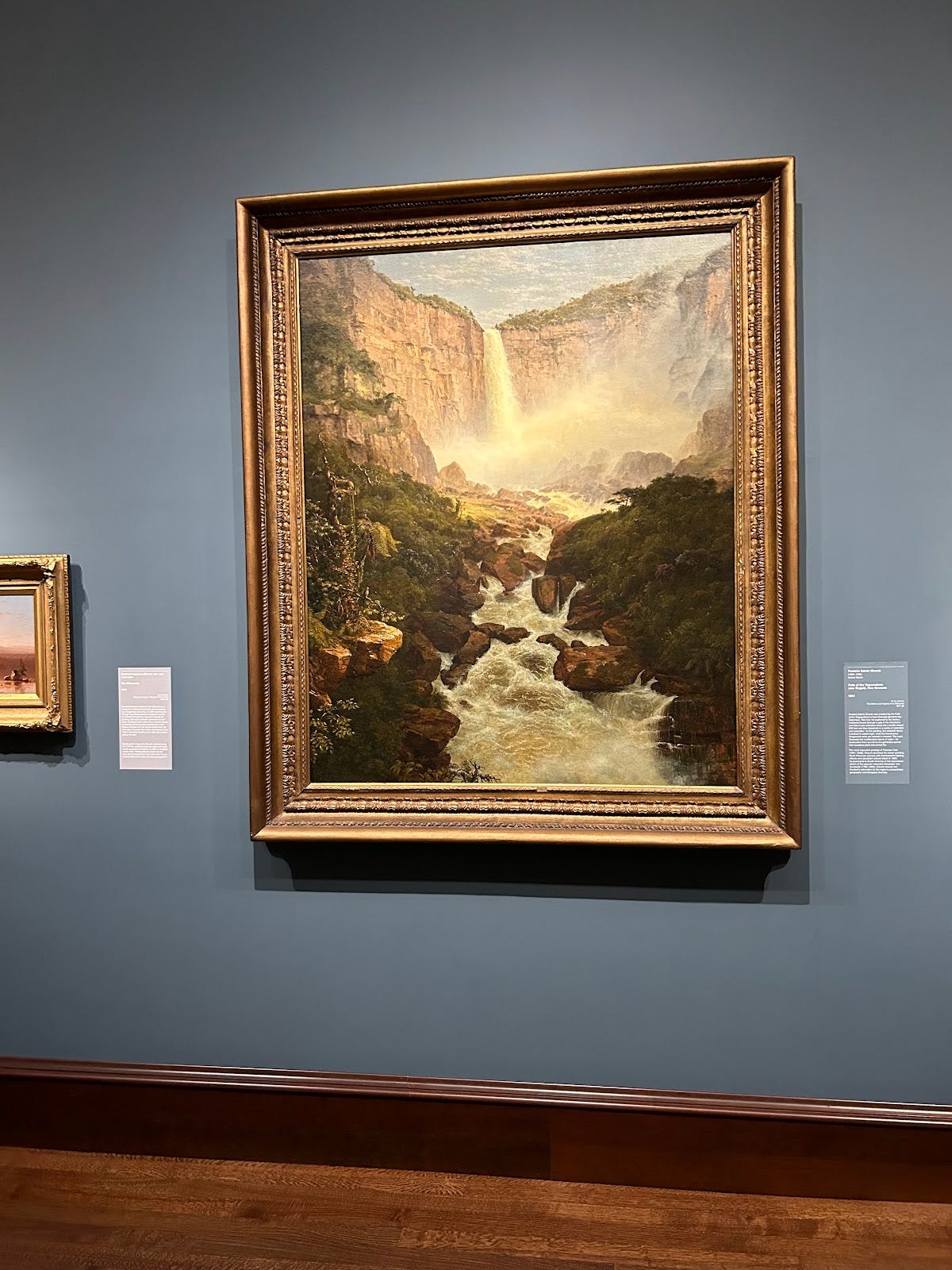
Like the scale of the landscape Church is showing the viewer, the frame, as well as the physical size, of the painting is immense in stature—these choices crafted the great grandeur he pictures.
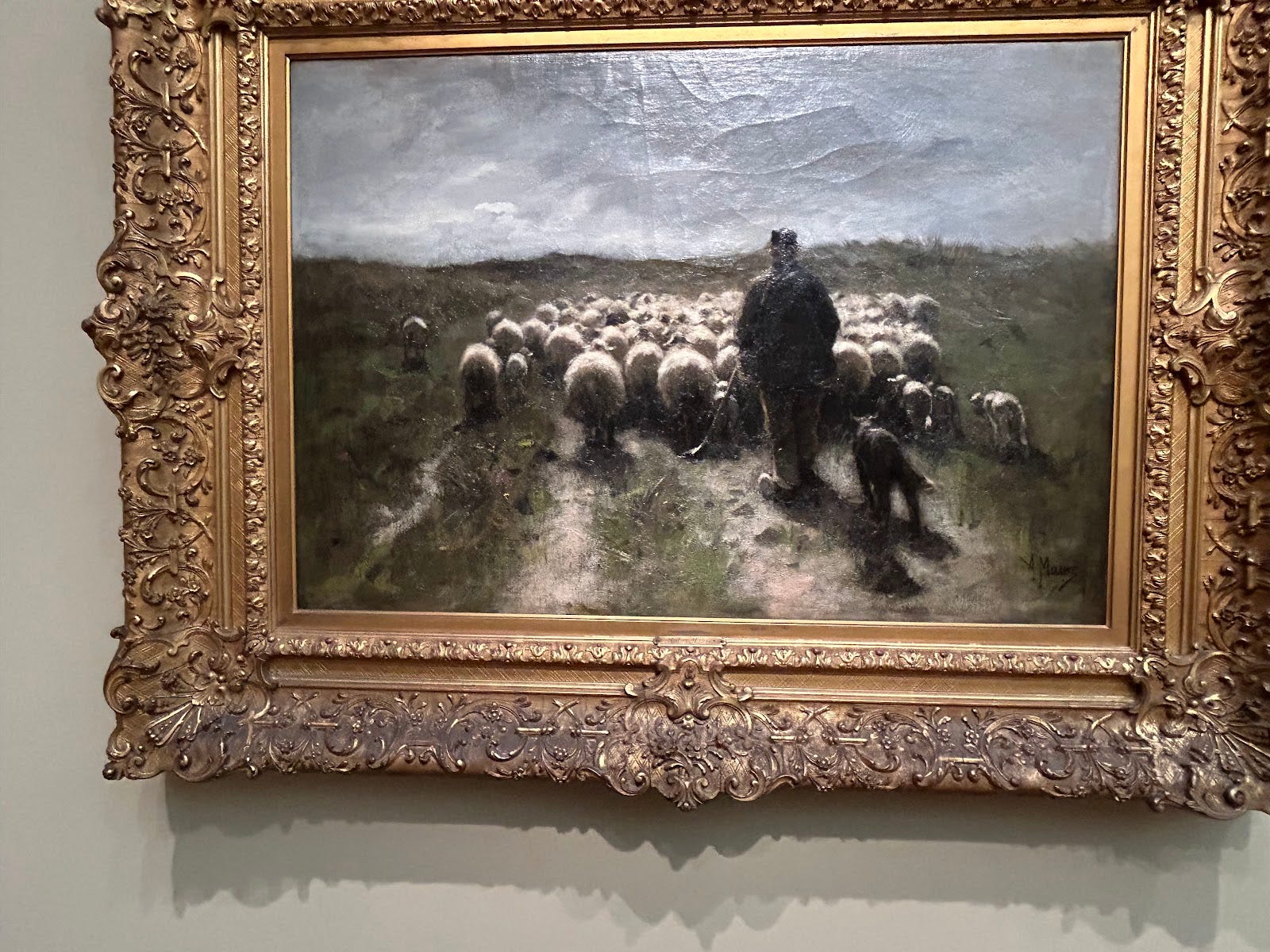
Mauve creates a great contrast between the Shepard and his sheep and the not-yet walked path and landscape beyond them: one is clearly defined and the other is a blob of color and occasionally, darker and lighter, variations of that color.
The swagger of this painting is huge and dominating.
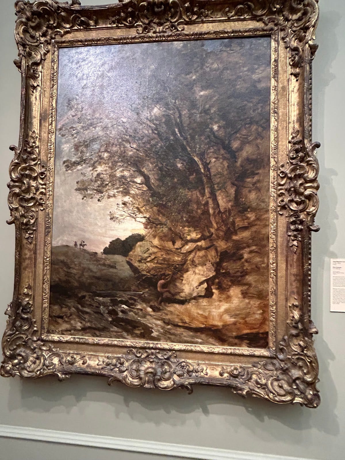
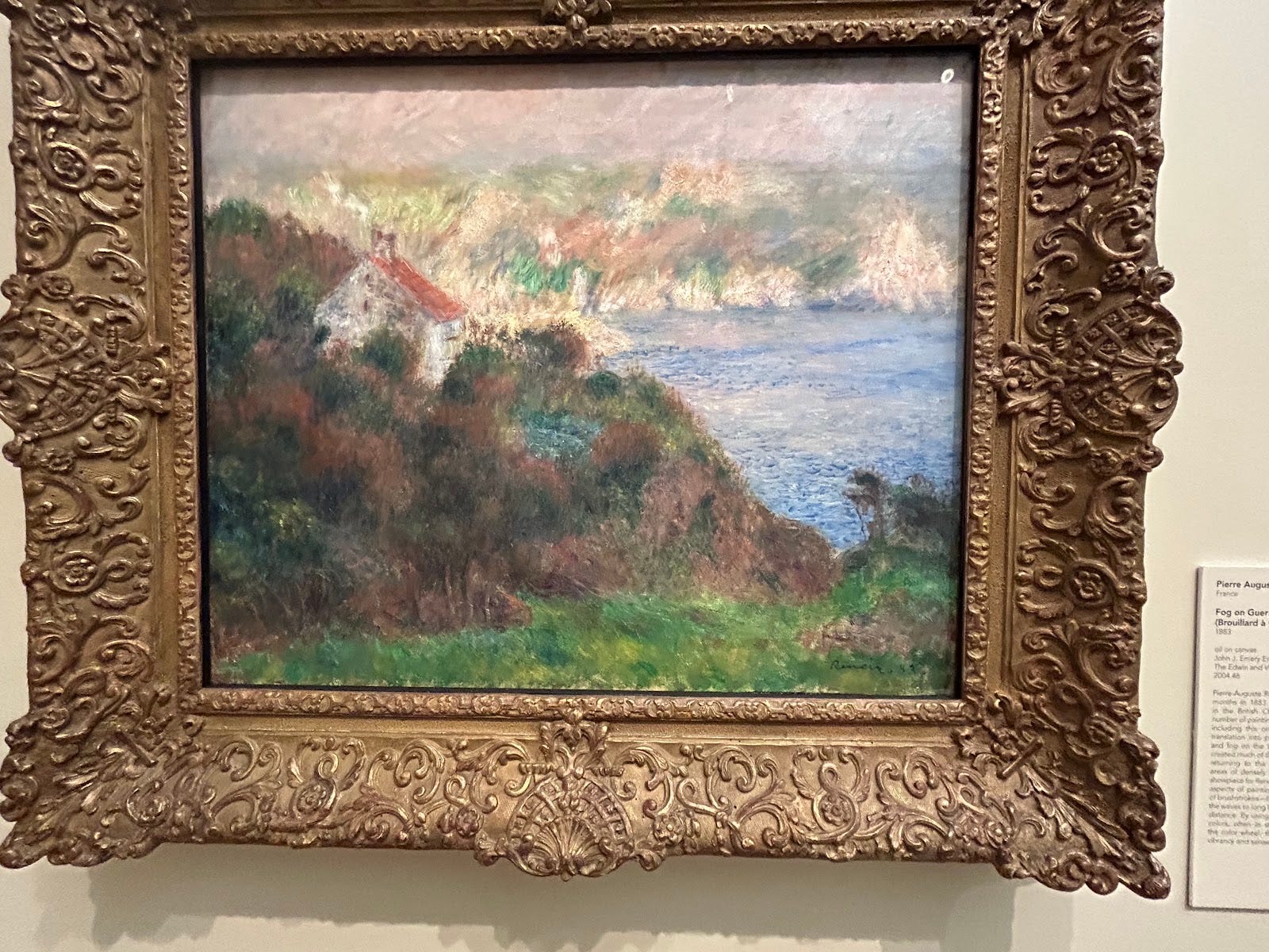
The atmosphere is crafted in a minimal number of strokes yet it still lies very believably and still captures its over-consuming feel as the subject might be experiencing presently enveloped in it.
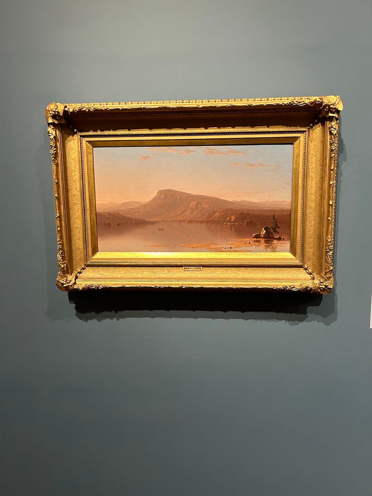
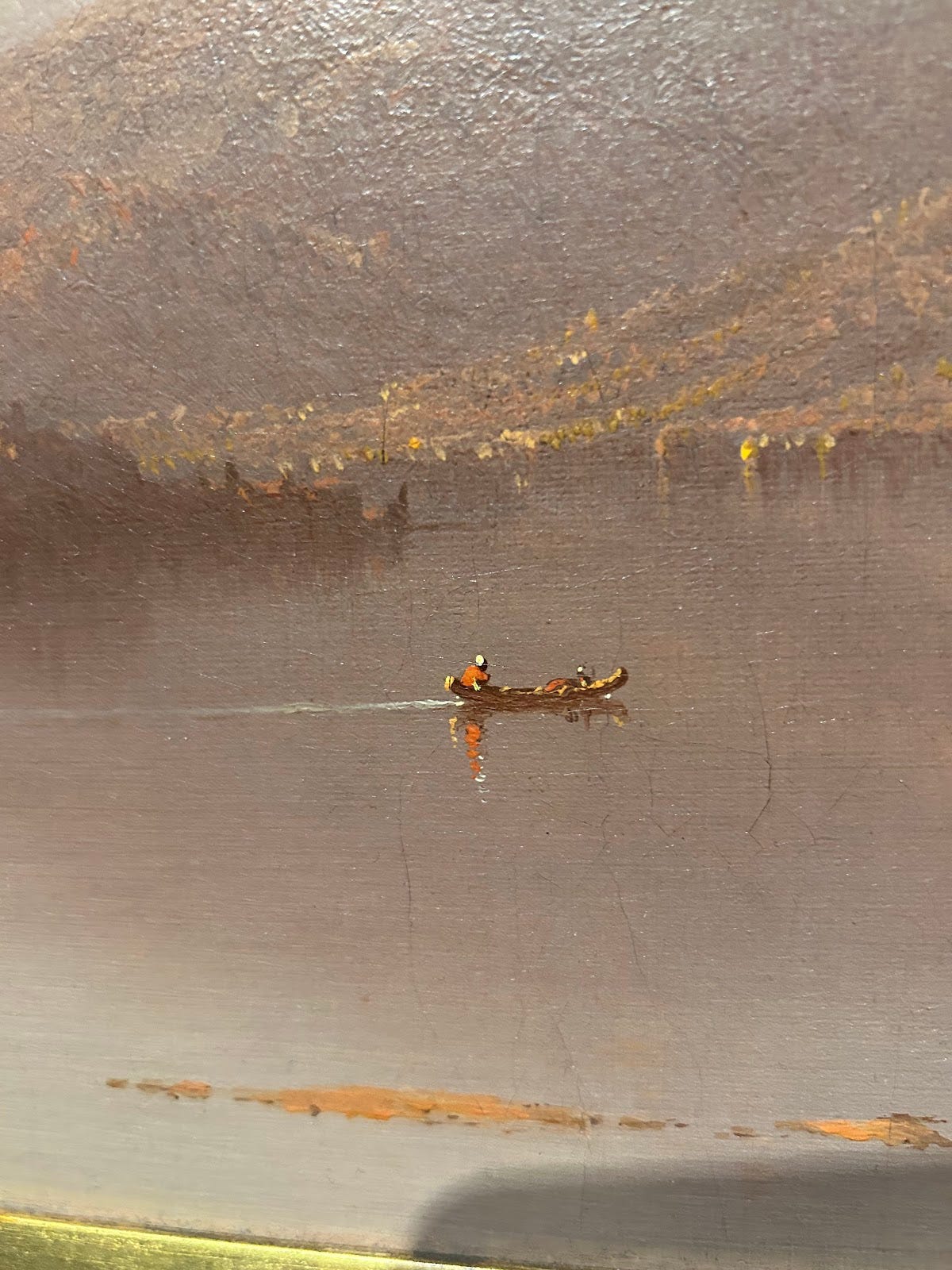
Despite the large landscape shown across the frame, Gifford chose a very small size to project this painting from his thoughts to brush.
I hypothesize this is because the picture’s main focus is not actually on the surrounding mountains, but on the lone traveler in the middle of the lake, so Gifford properly adjusted the size to match the painting’s true focus.
Like a lot of the religious of its time, this piece avoids dimension and, rather, focuses clearly on the—literally face-value—essence of the subject rather than their 3D components.
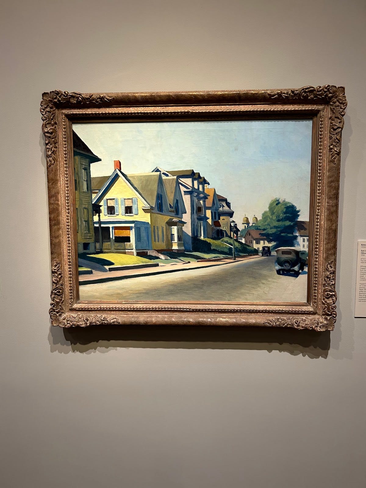
Hopper’s geometric landscape and stark shadows here create a painting almost like no other I’ve found.
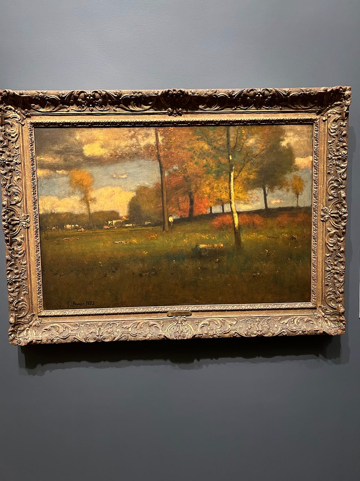
Inness shows a clearly windy setting in this piece and dips his toes into the realm of artists like Van Gogh and Pissarro: more concerned with capturing the weather and mood of a space rather than its complete and total, blunt specifics and exactness.
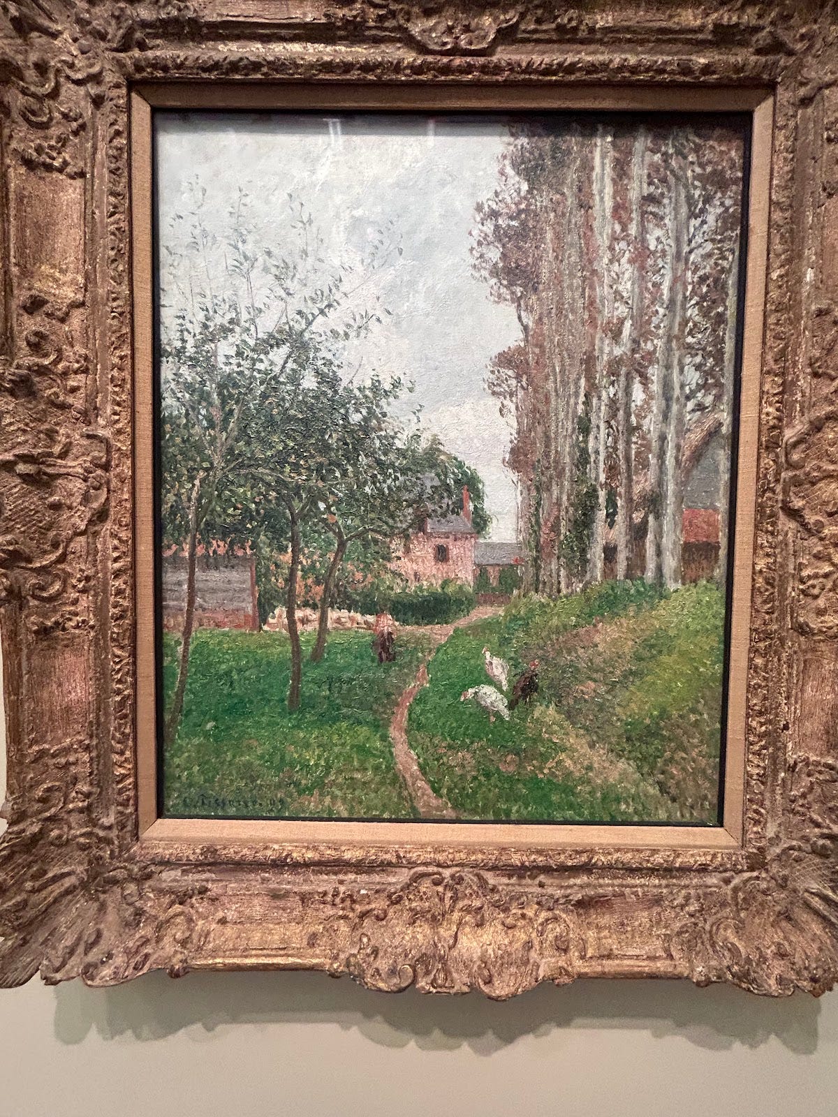
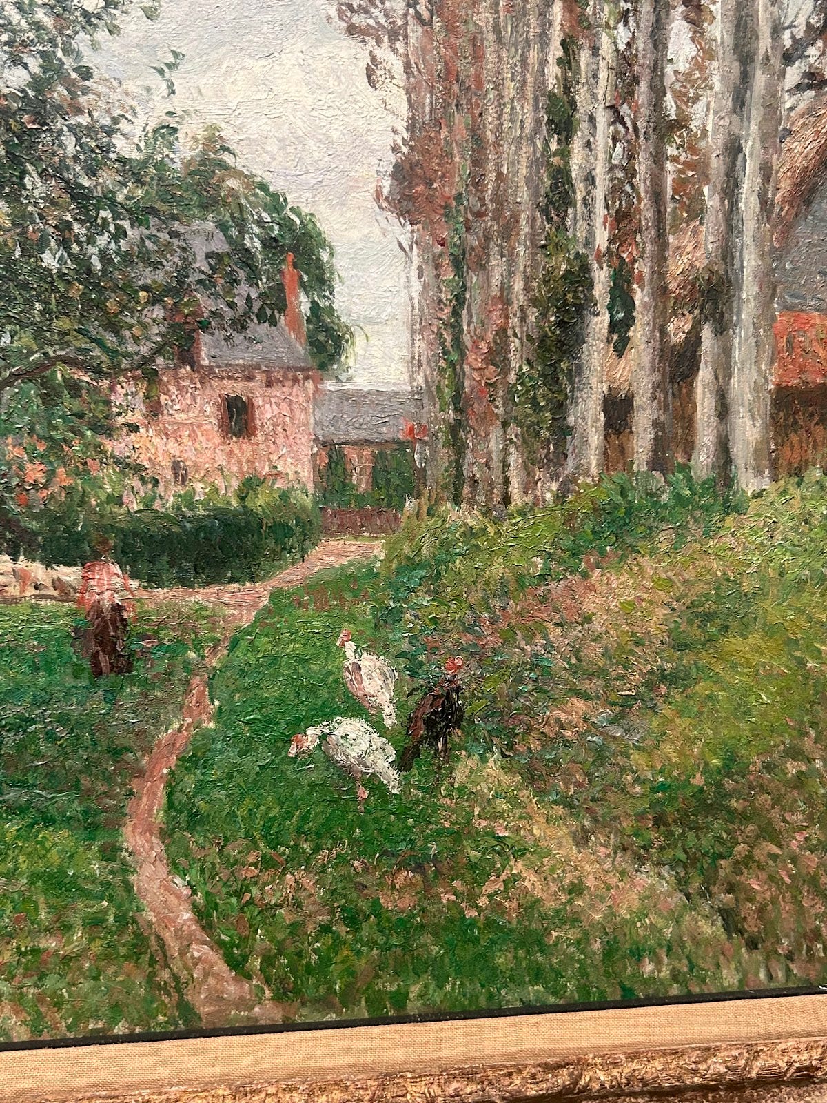
Pissarro lathers on paint in small dollops to create believable setting from afar but an almost incomprehensible scene up-close.
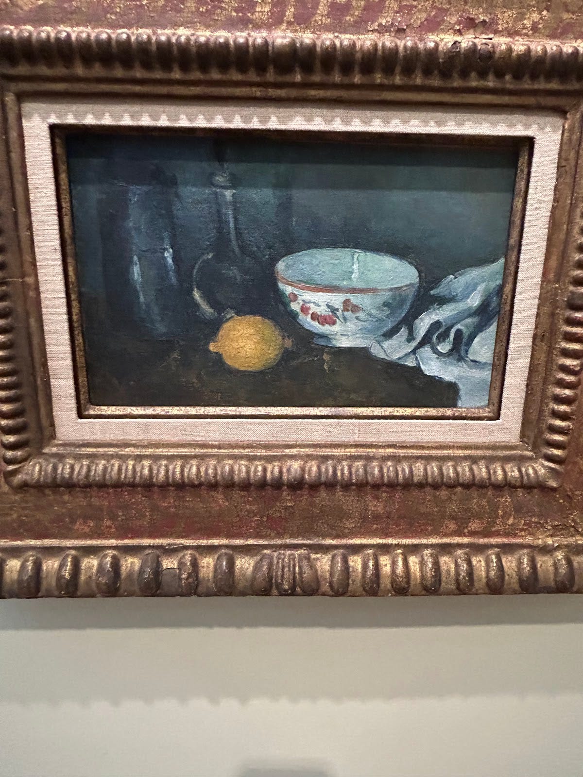
Quite opposed to the first entry in this list, Cezanne shows a very bleak and minimalistic picture of a lemon and glass.
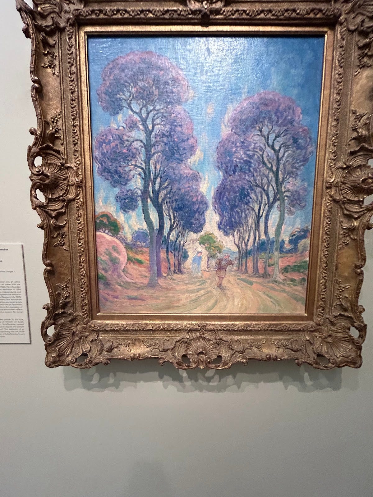
Following in the footsteps of Van Gogh, Schuffenecker uses color arbitrarily here to show contrast and mood through color theory and the symbolic meanings of colors.
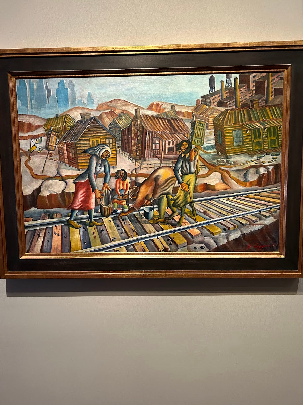
Exaggerating much of the body movements and surroundings of his characters, Biggers creates a cartoonish landscape but also one full of strangely alien people which is likely reflecting how others might view this black community with the lens of their own prejudice
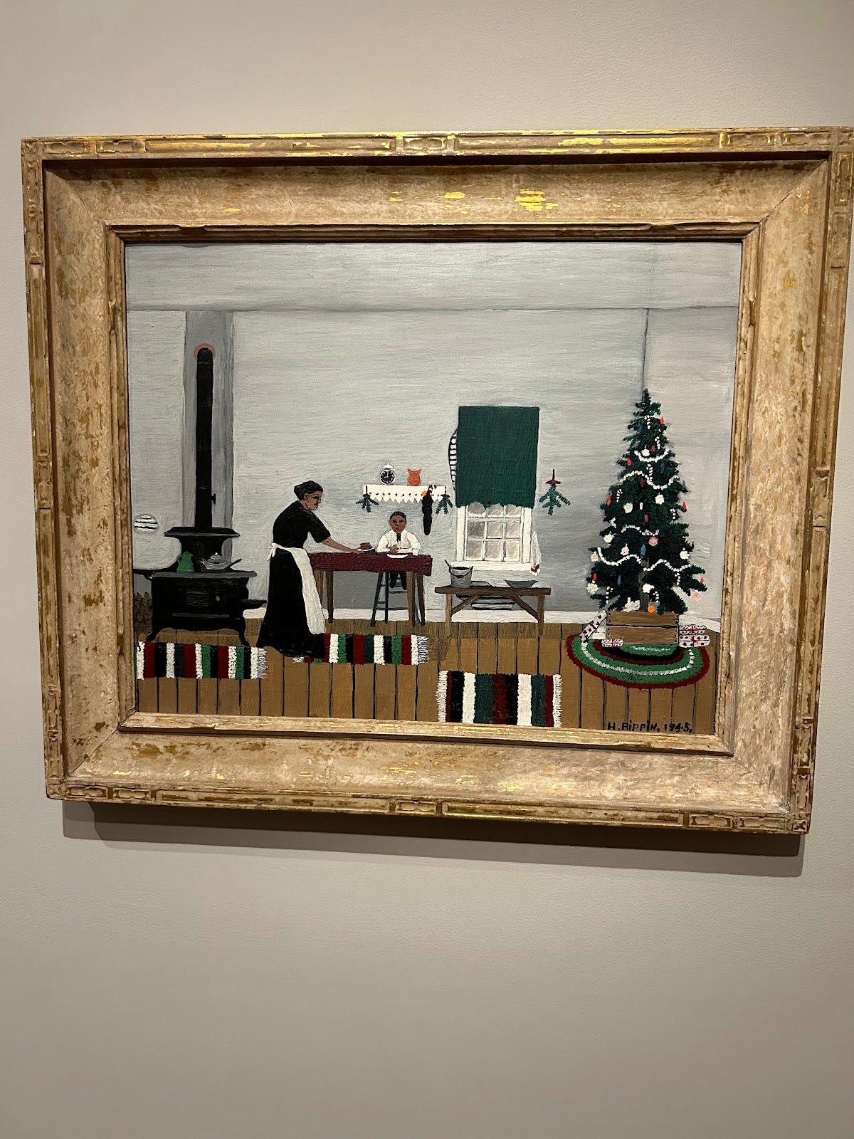
Pippin communicates with the viewer the reality of his childhood as a black American very intentionally by placing himself in an oddly 2D environment to subconsciously convey, to on-lookers, the bleakness and lack of dimension in his life at that time.
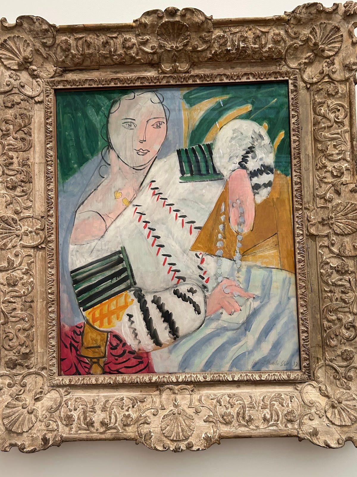
In Matisse’s piece, the appearance of hair has been reduced to a few strands and the face of the subject: only a couple of simple brush strokes.
Showing the movement around the horizon, Bazille narrows his environment to only splotches and obscured shapes of color, placed very strategically.
Leaning into the movement of Fauvism, Rouault wastes no time with tiny details and gives the viewer a simple impression *winks* of a—as I guess—festive scene.
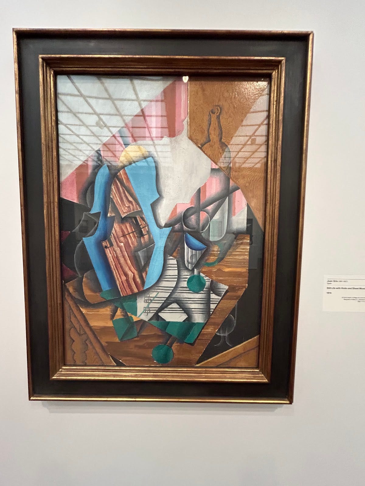
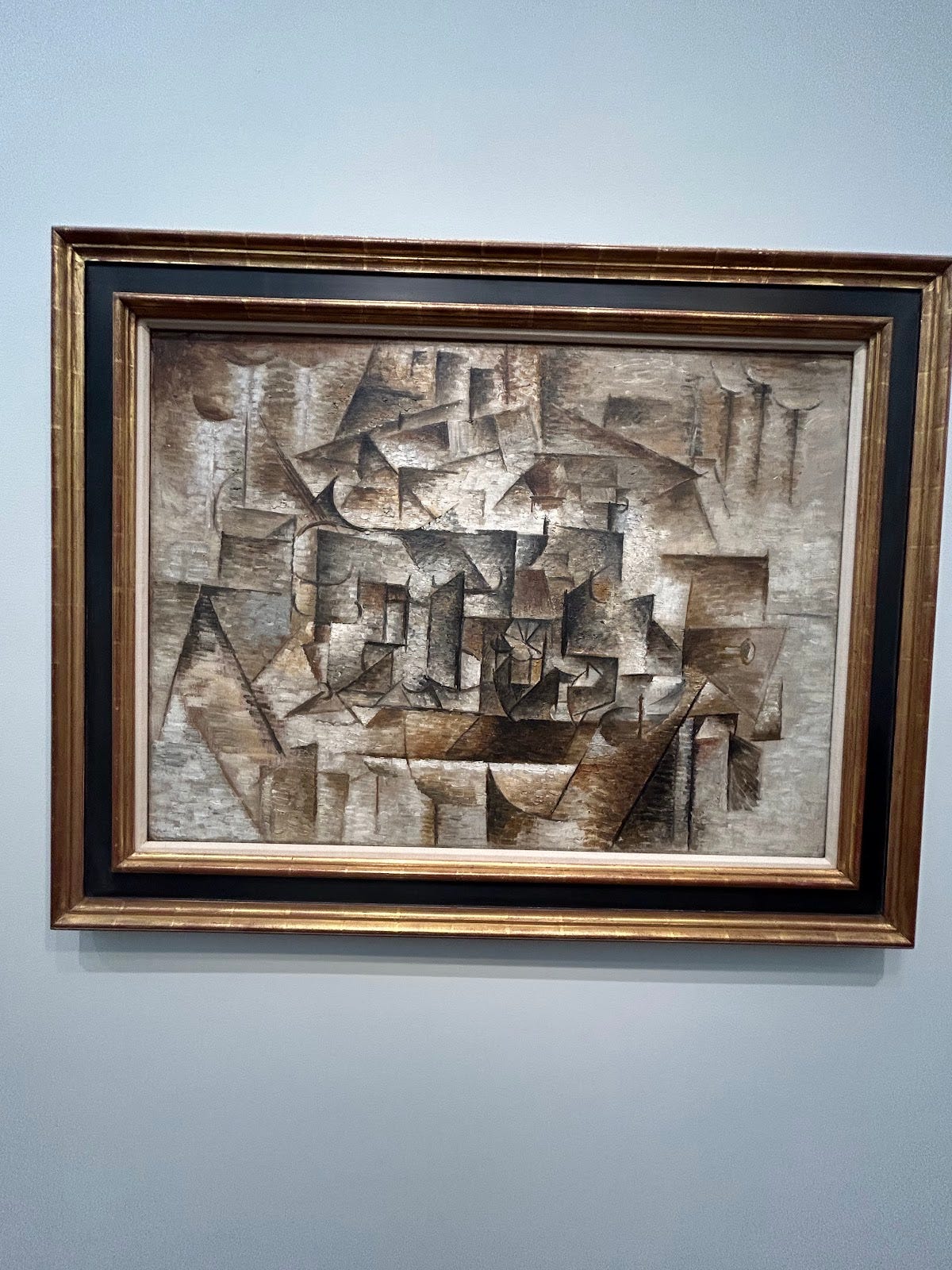
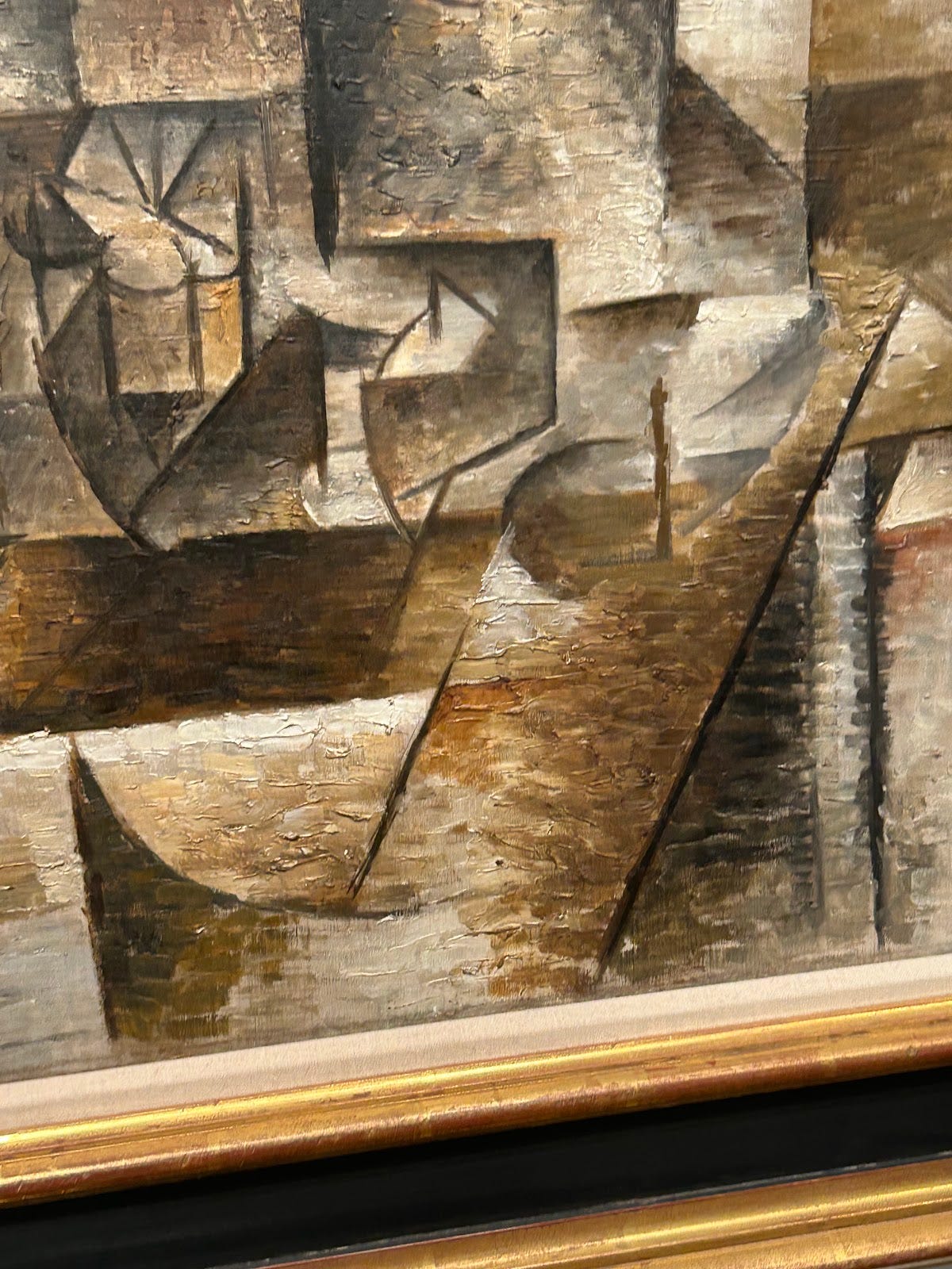
Forging a Cubist path, Gris shows us little glimpses of the actual form of a Violin of which the rest is covered by shapes reminiscent of its outline.
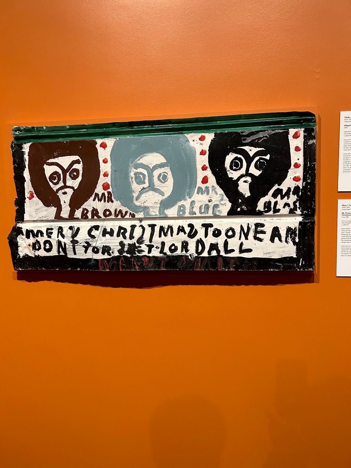
Smith shows the sad irony of corporate groups appealing to humanitarian movements as well as the stupidity of racism and prejudice with this sarcastic piece.
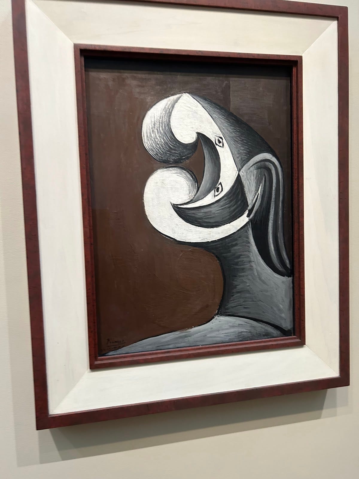
Finally abandoning any illusion of reality, Picasso shows a distorted face quite opposite to that of Rembrandt’s portraits whom I’m sure would be shocked to see this art if he were alive today.
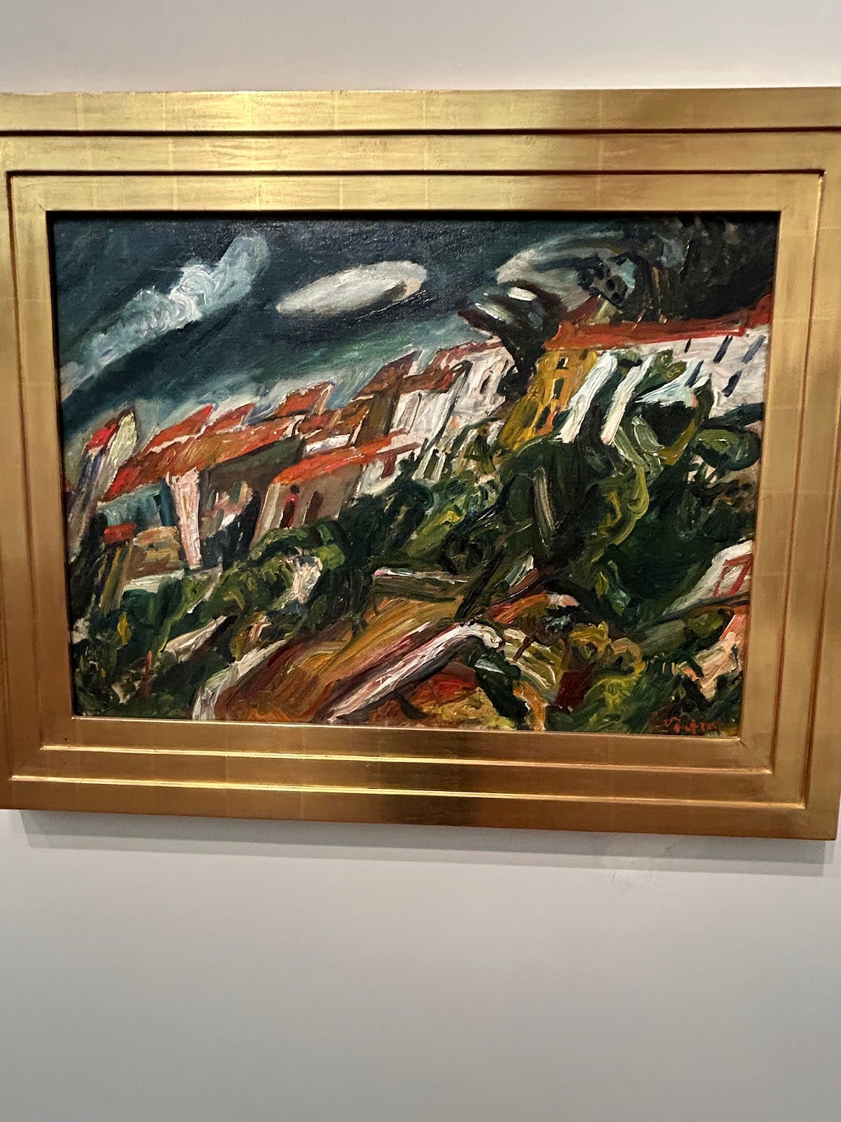
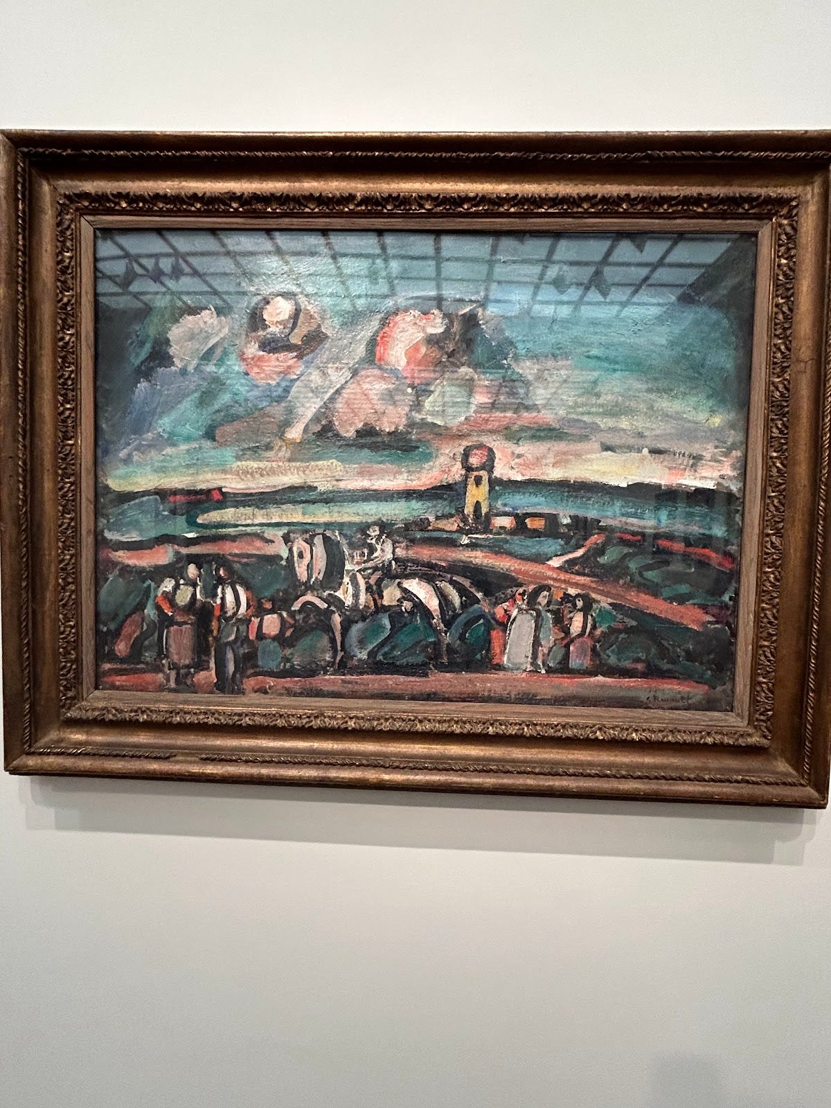
Capturing supposedly a town enveloped in a storm, Chaim moves further into the treacherous land of abstraction.
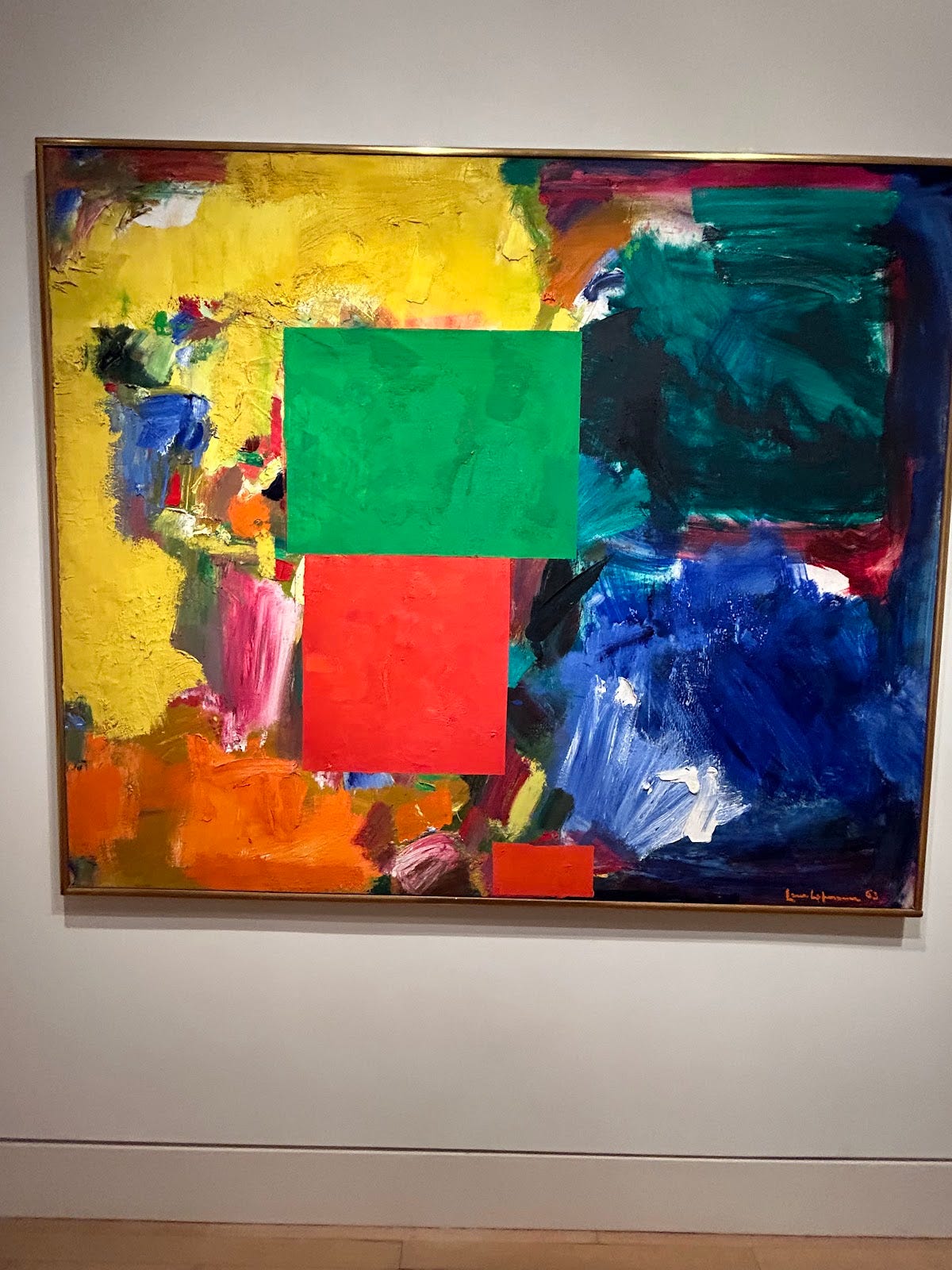
With only simple shapes, Moskowitz becomes the last on this list to convey to his viewer of something, in a not totally primitive projection, that we can see, and identify easily, in our existence as humans today.
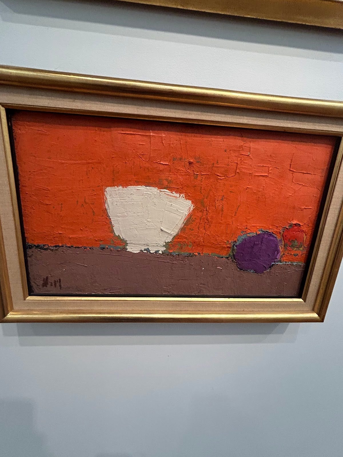
Another impression of a lemon and glass and Picasso removes all form and has nothing but lines to point if asked where the subjects are really located.
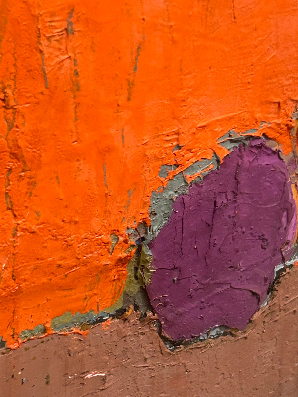
The focus of this painting is not on the color nor form of what it’s projecting, but, in reality, the texture of the physical paint.
Kind of looking like rocks… yet not really….
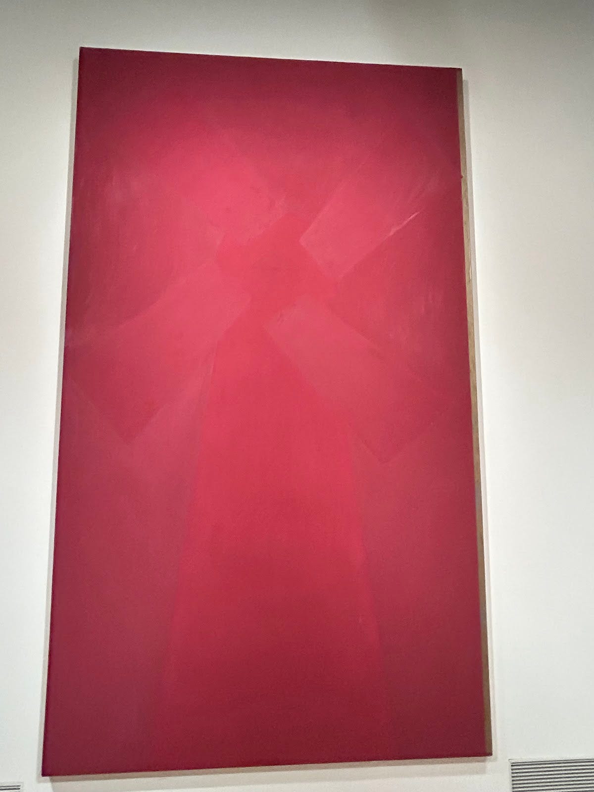
This leaves the viewer speechless with its utter abrasivity.
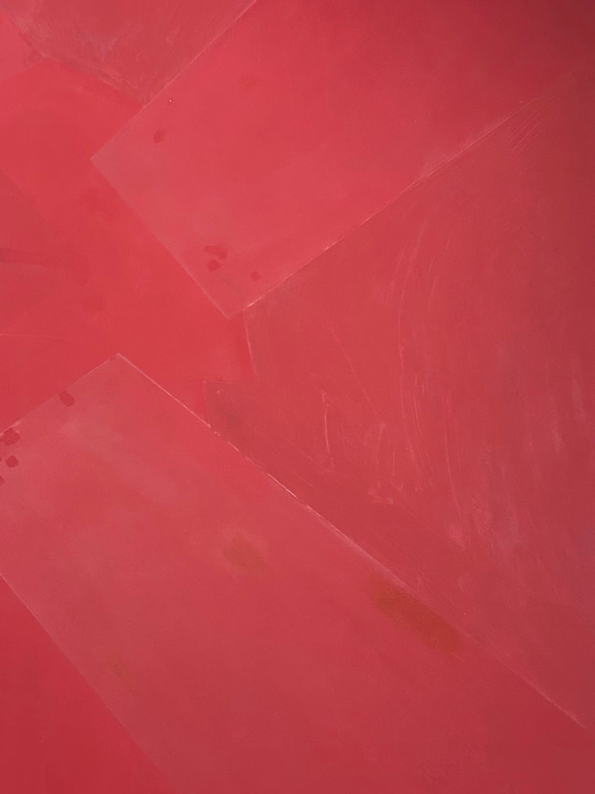
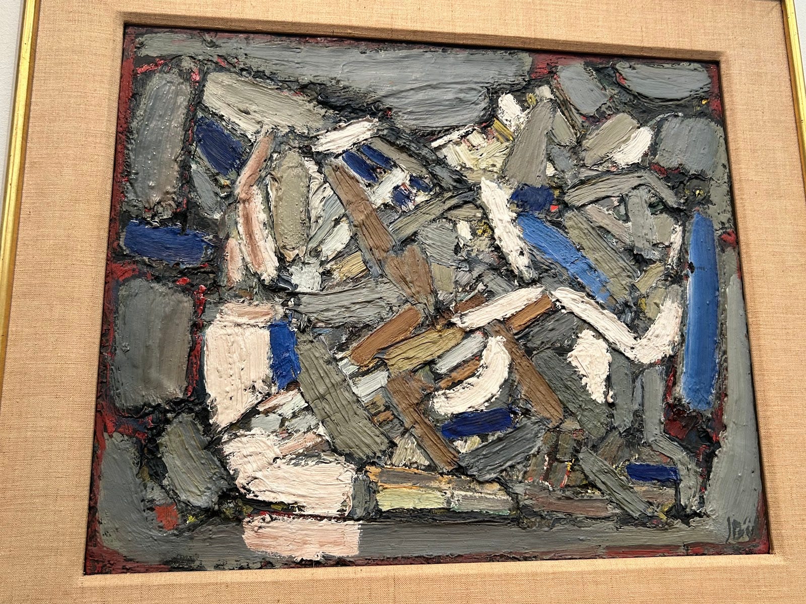
Colors and shapes, disorderly scattered about with no rhyme nor reason.
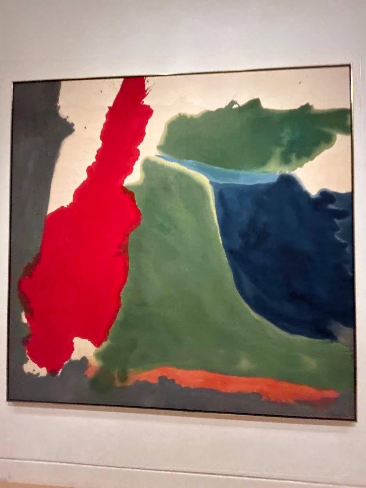
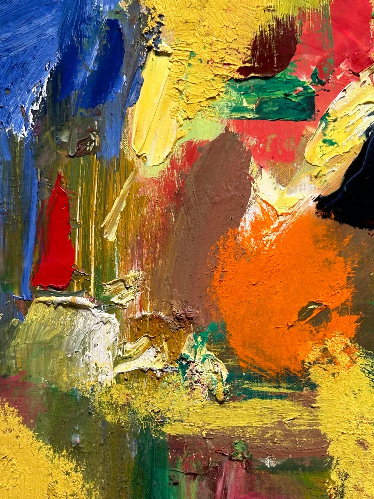
Another impression of rocks caps off the journey from clear, visible, articulated faces to only blobs of color not even reminiscent of anything in reality.
Just noticed a typo in the first sentence: 6 minutes late, not 6 minutes "last."